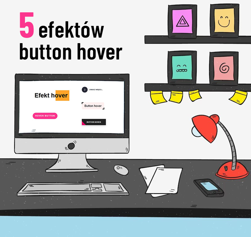
5 ciekawych efektów button hover w html i css
Przedstawię Wam 5 efektów button hover, które są warte uwagi. Takie przyciski z efektem po najechaniu, będą się ślicznie prezentować na stronie. Strona dzięki nim wyróżni się na tle konkurencji. Wystarczy stronę kodu html i css, by nadać im odpowiedni wygląd oraz efekt.

1. Efekt hover tekstu
Pierwszy efekt jaki przedstawię, to będzie tekst, który po najechaniu kursorem zmieni kolor tła, które będzie płynnie przesuwać się w bok.
Dodajemy kod html:
<h1>Efekt hover</h1>
Jak widać jest to nagłówek <h1>. Może to być cokolwiek innego, nagłówek h2, div, p, czy button z odnośnikiem.
Dodajemy kod css:
h1 {
	display: inline-block;
	position: relative;
	padding: 0.3em;
	font-size: 3rem;
}

h1::before {
	transform: scaleX(0);
	transform-origin: bottom right;
}

h1:hover::before {
	transform: scaleX(1);
	transform-origin: bottom left;
}

h1::before {
	content: " ";
	display: block;
	position: absolute;
	top: 0;
	right: 0;
	bottom: 0;
	left: 0;
	inset: 0 0 0 0;
	background: #ffa428;
	z-index: -1;
	transition: transform 0.3s ease;
}
2. Efekt button hover z przesuwanym tłem
Tutaj będzie button, który po najechaniu zmieni kolor tła i tło płynnie przesunie się w bok.
Dodajemy kod html:
<a href="#" class="button">Hover button</a>
Dodajemy kod css:
.button {
	display: inline-block;
	padding: 1em 1.25em;
	border-radius: 10rem;
	color: #fff;
	text-transform: uppercase;
	font-size: 1rem;
	font-weight: 600;
	letter-spacing: 0.15em;
	transition: all 0.3s;
	position: relative;
	overflow: hidden;
	z-index: 1;
	text-decoration: none;
}
.button:after {
	content: "";
	position: absolute;
	bottom: 0;
	left: 0;
	width: 100%;
	height: 100%;
	background-color: #ff348c;
	border-radius: 10rem;
	z-index: -2;
}
.button:before {
	content: "";
	position: absolute;
	bottom: 0;
	left: 0;
	width: 0%;
	height: 100%;
	background-color: #e70063;
	transition: all 0.3s;
	border-radius: 10rem;
	z-index: -1;
}

.button:hover:before {
	width: 100%;
}
3. Efekt button hover ze strzałką i przesuwanym tłem
Tu efekt jest bardzo ciekawy. Mamy po lewej ikonkę strzałki, w kółku z tłem i po najechaniu zamienia się ona na button, płynnie przesuwając się w prawo.
Dodajemy kod html:
        <button class="learn-more">
            <span class="circle" aria-hidden="true">
                <span class="icon arrow"></span>
            </span>
            <span class="button-text">zobacz więcej...</span>
        </button>
Dodajemy kod css:
button {
	position: relative;
	display: inline-block;
	cursor: pointer;
	outline: none;
	border: 0;
	vertical-align: middle;
	text-decoration: none;
	background: transparent;
	padding: 0;
}
button.learn-more {
	width: 13rem;
	height: auto;
}
button.learn-more .circle {
	transition: all 0.45s cubic-bezier(0.65, 0, 0.076, 1);
	position: relative;
	display: block;
	margin: 0;
	width: 3rem;
	height: 3rem;
	background: #282936;
	border-radius: 1.625rem;
}
button.learn-more .circle .icon {
	transition: all 0.45s cubic-bezier(0.65, 0, 0.076, 1);
	position: absolute;
	top: 0;
	bottom: 0;
	margin: auto;
	background: #fff;
}
button.learn-more .circle .icon.arrow {
	transition: all 0.45s cubic-bezier(0.65, 0, 0.076, 1);
	left: 0.625rem;
	width: 1.125rem;
	height: 0.125rem;
	background: none;
}
button.learn-more .circle .icon.arrow::before {
	position: absolute;
	content: "";
	top: -0.25rem;
	right: 0.0625rem;
	width: 0.625rem;
	height: 0.625rem;
	border-top: 0.125rem solid #fff;
	border-right: 0.125rem solid #fff;
	transform: rotate(45deg);
}
button.learn-more .button-text {
	transition: all 0.45s cubic-bezier(0.65, 0, 0.076, 1);
	position: absolute;
	top: 0;
	left: 0;
	right: 0;
	bottom: 0;
	padding: 0.75rem 1.5rem;
	margin: 0 0 0 1.85rem;
	color: #282936;
	font-weight: 600;
	line-height: 1.6;
	font-size: 13px;
	text-align: center;
	text-transform: uppercase;
}
button:hover .circle {
	width: 100%;
}
button:hover .circle .icon.arrow {
	background: #fff;
	transform: translate(1rem, 0);
}
button:hover .button-text {
	color: #fff;
}
4. Efekt button z ruchomym krawędziami – border
Również ciekawy efekt, który zmienia małe narożniki, przechodząc w całe obramowanie buttona.
Dodajemy kod html:
<span class="btn">Button hover</span>
Dodajemy kod css:
.btn {
	cursor: pointer;
	position: relative;
	padding: 15px 22px;
	background: rgb(255, 240, 240);
	font-size: 25px;
	border-top-right-radius: 10px;
	border-bottom-left-radius: 10px;
	transition: all 1s;
}

.btn:after,
.btn:before {
	content: " ";
	width: 10px;
	height: 10px;
	position: absolute;
	border: 0px solid #fff;
	transition: all 1s;
}

.btn:after {
	top: -1px;
	left: -1px;
	border-top: 5px solid black;
	border-left: 5px solid black;
}

.btn:before {
	bottom: -1px;
	right: -1px;
	border-bottom: 5px solid black;
	border-right: 5px solid black;
}

.btn:hover {
	border-top-right-radius: 0px;
	border-bottom-left-radius: 0px;
}

.btn:hover:before,
.btn:hover:after {
	width: 100%;
	height: 100%;
}
5. Efekt button zmiany tła pod kątem.
Ostatni efekt to zmiana tła buttony, które pojawia się z lewego narożnika i pod kątem płynnie przechodzi w prawo.
Dodajemy kod html:
<button class="btn2"><span>Button hover</span></button>
Dodajemy kod css:
.btn2 {
	border: none;
	display: block;
	text-align: center;
	cursor: pointer;
	text-transform: uppercase;
	outline: none;
	overflow: hidden;
	position: relative;
	color: #fff;
	font-weight: 600;
	font-size: 15px;
	background-color: #222;
	padding: 17px 40px;
	box-shadow: 0 5px 15px rgba(0, 0, 0, 0.2);
}

.btn2 span {
	position: relative;
	z-index: 1;
}

.btn2:after {
	content: "";
	position: absolute;
	left: 0;
	top: 0;
	height: 490%;
	width: 140%;
	background: #e70063;
	-webkit-transition: all 0.5s ease-in-out;
	transition: all 0.5s ease-in-out;
	-webkit-transform: translateX(-98%) translateY(-25%) rotate(45deg);
	transform: translateX(-98%) translateY(-25%) rotate(45deg);
}

.btn2:hover:after {
	-webkit-transform: translateX(-9%) translateY(-25%) rotate(45deg);
	transform: translateX(-9%) translateY(-25%) rotate(45deg);
}
Na koniec załączam video z efektem działania buttonów po najechaniu kursorem 🙂